
Power BI is super cool but it does have a bit of learning curve to get proper value from it. You also need to pay for licenses if you try share your dashboard in Power BI. Until you get to that point, you can still use good old Excel to get things done. Plus this is a cool way to blend out of box classic and modern functionality.
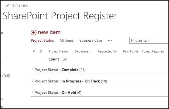
Step 1 – have a custom list with the data you need to display.
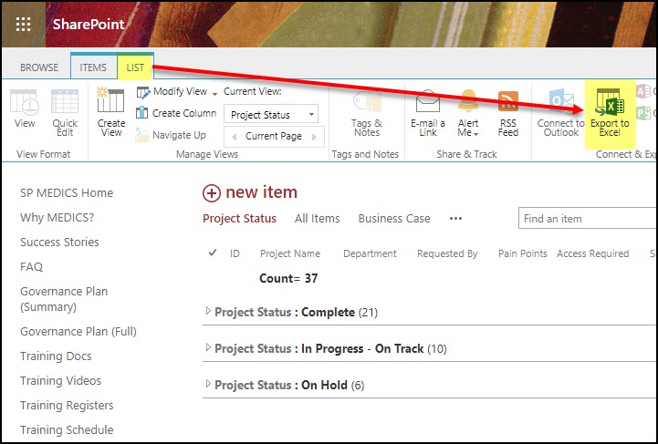
Step 2 – export the list data to Excel.
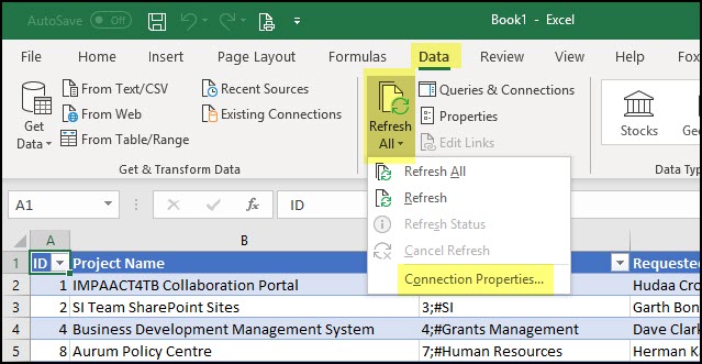
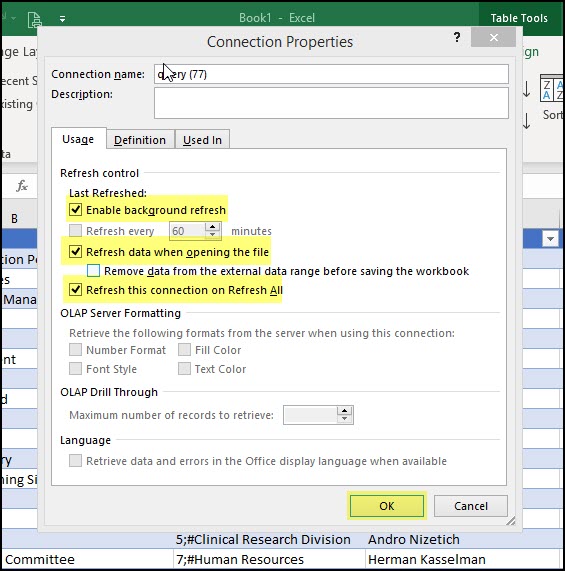
Step 3 – connect the Excel spreadsheet to the list data using these settings.
Step 4 – create the charts you want in Excel, taking note of the graph names. All formatting of charts has to happen in Excel, you can’t do that in SharePoint.

Step 5 – upload the spreadsheet to a library on the site, (we like to create a Dashboard library for this purpose if there’s a lot of lists you want to do this with).
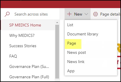
Step 6 – create a modern page and add the File Viewer web part.
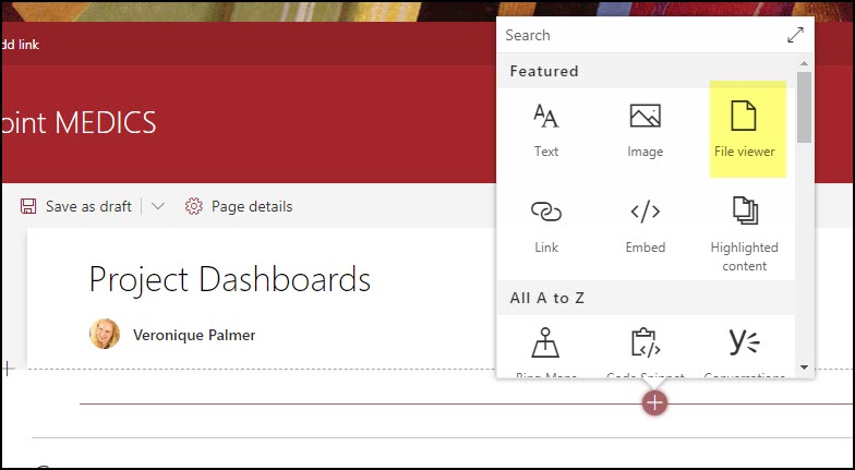
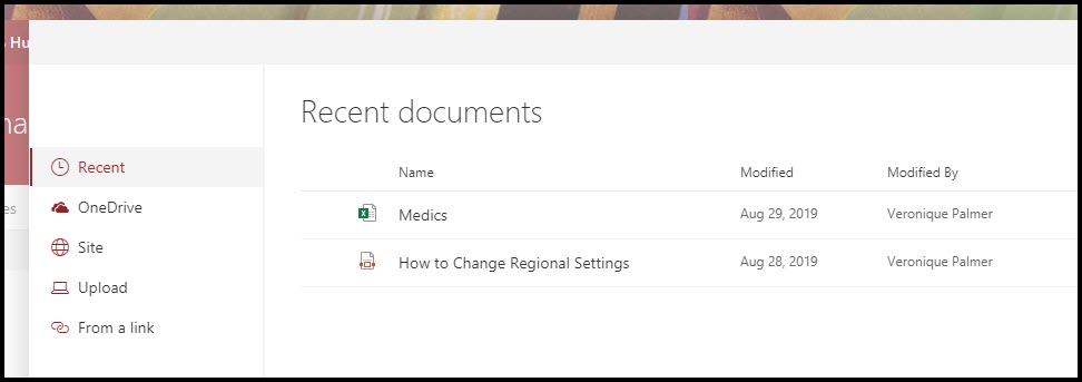
Step 7 – point the web part to the Excel document, and choose Chart in the settings, put the chart name in.

Step 8 – publish and admire your handywork!

HOT TIPS!
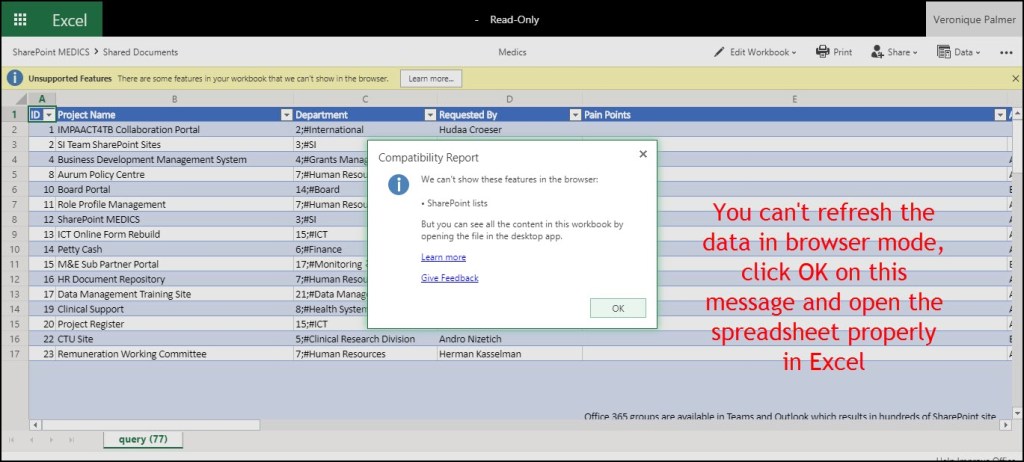
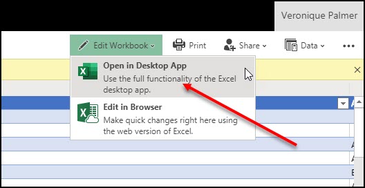
The system isn’t 100% perfect, because you will need to refresh the data on the Excel document to get the latest graphs – BUT, at least you can get cool reporting out with no code or additional licenses. You do need to open the document in Excel itself, not the browser version.


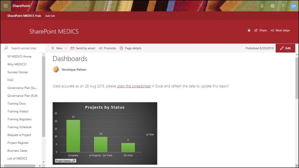
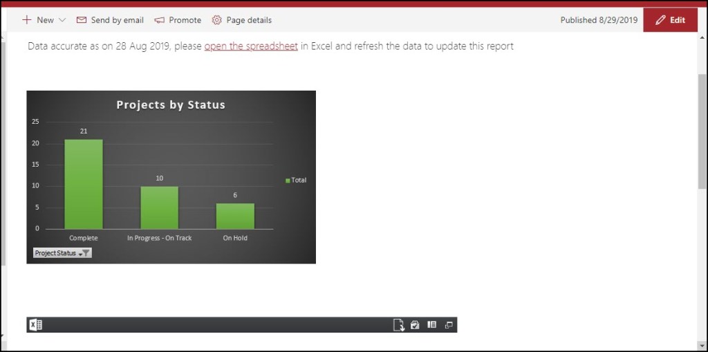
We like to add text above the charts to specify something like “Data correct as on 26 August 2019, please open the Excel spreadsheet and refresh the data”, with a link to the document that opens in another tab.

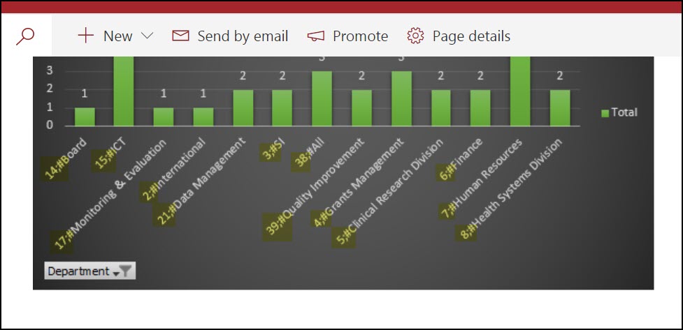
When the charts are in, you can filter as required.


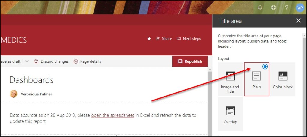
When you create the page, use the plain header formatting so you have more space to see the graphs.
If you put a graph into a one block section, it makes a silly big white space under it. To get around this, change the section layout to 2 columns.
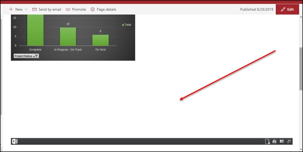

Putting 2 charts next to each other, puts scrollbars in, depending on the size of your charts. So use the above layout to get around that.

If you are using Managed Metadata columns in your data, they put stoopid characters in front of the items. It’s very annoying. The only away around that would be to clone the columns in SharePoint Designer to display as text fields so the data comes out clean.
And that’s that! Give it a whirl.
